ffilm.org / fieldnotes Field Notes

ffilm.org / fieldnotes

A living log of builds, rooms, evidence, experiments and weather from the workbench.

Showing notes tagged build. Clear filter
Art build diary music

28 Jul 2026

Not The Final Vinyl: Record Label as Instrument

NotTheFinalVinyl.net does not treat a record label catalogue as a list of products. It treats it as a space, an object and a performance.

...read more

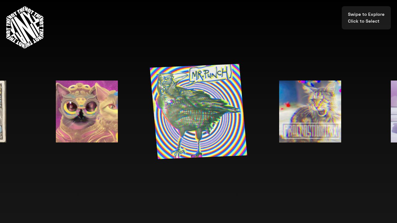
At the centre of the site is a three-dimensional procession of record sleeves built in Three.js. The releases are not reduced to thumbnails in a shop grid. They occupy depth. They overlap, move, tilt, recede and come forward. The visitor navigates through them by swiping, scrolling, using arrow keys or clicking directly on a sleeve.

Selecting the central record causes the vinyl itself to slide out of its cover and begin rotating, while the Bandcamp player appears over the scene.

The interface does not merely tell you that these are records. It makes the record (square sleeve, black disc, physical handling) the organising principle of the software.

It is a catalogue made from the behaviour of its subject.

Not The Final Vinyl desktop view

Browsing as handling

Most label websites inherit the visual grammar of ecommerce: a logo, a grid of releases, cover art, a short description, a buy button.

Not The Final Vinyl rejects that. Its basic interaction is closer to rifling through records in a shop, moving along a shelf or watching sleeves pass through a mechanical display.

The site gives every release a spatial relationship to the others. There is a centred record, neighbouring records and records waiting beyond the edge of the visible field. Navigation is circular, so the catalogue wraps around rather than terminating like a conventional sequence of pages.

The release data is shuffled when it loads. The website does not always begin with the same record or imply that the catalogue has a single authoritative ordering. Each visit becomes a new dig through the crate.

That favours discovery over hierarchy. For a collective catalogue, it avoids unconsciously ranking one artist above another through a static homepage order.

The record as interface

The most memorable interaction is the vinyl sliding out of the sleeve.

The cover and record are separate Three.js meshes grouped together as one album object. The sleeve is a square plane textured with the release artwork. The record is a circular geometry using a transparent vinyl image. It begins hidden behind the cover and moves horizontally when the release is selected.

The record accelerates into rotation rather than abruptly starting. Its spin speed increases gradually to a maximum and decays when playback ends. Objects tilt and lift rather than merely changing size. Positions, rotations and vinyl movement are interpolated over time, producing a soft mechanical response rather than the hard switching of ordinary page elements.

The effect is not photorealism. It is object-belief. The user knows it is a browser illusion, but the application gives the illusion consistent rules: a record has a sleeve, it can be pulled out, it can spin, it occupies depth and it can be returned.

Bandcamp without surrendering the experience

When a record is selected, the site constructs a Bandcamp iframe dynamically. Only the required embed is inserted, and it is removed when the overlay closes. The player appears as the culmination of the physical metaphor: first the user approaches a sleeve, then the record comes out, then the music interface opens.

Commerce is delegated to Bandcamp. The site does not attempt to reproduce Bandcamp's account system, checkout, tax handling or file delivery. It adds an authored discovery layer on top of an established platform.

That is sensible independent-label engineering: build the part that creates identity, do not unnecessarily rebuild the infrastructure that already works.

Data pipeline

A Python scraper gathers and transforms the Bandcamp catalogue into a normalised JSON structure:

Bandcamp catalogue → Python scraping and extraction → Normalised releases.json → Local artwork and structured metadata → Three.js gallery → Embedded Bandcamp listening and purchasing

The JSON boundary provides resilience. The site does not need to scrape Bandcamp every time someone visits. Data is generated periodically, then served as a static asset. The public-facing application remains quick and simple.

Engineering architecture

The JavaScript is divided into distinct areas: scene management, album objects, vinyl control, navigation, event handling, UI display, animation utilities and data loading. The central AlbumGallery class acts as an orchestrator, creating components in a required order, beginning loading, constructing album objects, starting the animation loop and coordinating cleanup if initialization fails.

That modularity was not merely good taste. It was a survival strategy. Built during the early period of AI-assisted programming, when coding models could process only roughly a thousand lines at a time, the application had to be broken into pieces that could be reasoned about, edited and reintroduced without the model seeing the whole thing at once.

The human developer remained the only participant who held the whole application in mind. The model could contribute pieces, patterns, repairs and local solutions, but architectural continuity had to be maintained manually.

Multi-device interaction

The catalogue supports mouse hover, click, horizontal trackpad and mouse-wheel navigation, touch taps, touch swipes, arrow keys, Escape to close, and responsive resizing. Touch input tracks start position, duration and whether the finger moved. A short stationary touch is interpreted as a tap; a sufficiently large horizontal movement becomes navigation.

Safari-specific wheel normalization and increased touch cooldowns suggest the site was tested against real browser behaviour rather than only against a desktop Chrome happy path.

What the project demonstrates

As design: a catalogue can inherit the properties of the thing it catalogues.

As frontend engineering: asynchronous asset loading, WebGL rendering, stateful animation, raycast interaction and multi-input navigation.

As a data project: extraction, normalization and transformation of Bandcamp material into a local JSON model.

As a platform: discovery, playback, outbound commerce, mailing-list capture, analytics, social metadata and administrative tools.

As an historical object: the early period of AI-assisted programming, when the model could contribute meaningfully to a complex build but the developer had to act as its external memory and integration layer.

Records should be encountered as records. That is the site's argument, and it is expressed structurally, not just stated in copy.

Originally posted on Contra: https://contra.com/p/OcAM62MW-not-the-final-vinyl-record-label-as-instrument
28 Jul 2026

Breaktesting: Human Intelligence vs AI Systems

Breaktesting is the practice of finding where AI systems fail against real human intelligence — not through standardised benchmarks, but through the kind of messy, embodied, intuitive tasks that humans handle naturally.

...read more

Red-teaming asks: can we make it say something dangerous?

Benchmarking asks: how does it score on this test?

Breaktesting asks: can it actually do the thing?

The answer, surprisingly often, is no.

Case Study 1: The Pirate Code

In 2005, I designed a hand-drawn cipher puzzle called Vibration 13: Le Code du Pirate. A custom alphabet of 13 symbols, each representing two letters distinguished by a dot. Three obscure geographical locations encoded in the cipher. A triangulation problem leading to a tiny Indonesian island called Natuna Besar.

I deployed it as a Flash interactive. Thousands played. 274 people solved it.

In February 2026, I tested both Claude (Anthropic's Opus 4.6) and ChatGPT against the same puzzle.

Neither solved it.

ChatGPT spent over thirty minutes cropping and zooming the image, burning significant computational resources, and produced confident but wrong symbol readings. It hallucinated answers with full conviction. Score: 3/10.

Claude admitted early that it couldn't reliably read the hand-drawn symbols. It understood the cipher logic when I explained it, verified the geography when I provided decoded place names, but could not perform the core task: reading symbols from a drawn page. It was honestly useless rather than confidently wrong. Score: 2/10, Claude's own self-assessment.

A puzzle designed twenty years ago, solvable by hundreds of humans with an atlas and a pencil, defeated both frontier AI systems comprehensively.

Case Study 2: The Puzzle Pebble

My father, Reinold "Rhino" Godden, was a toymaker in Ystradgynlais. In 1996 he designed the Puzzle Pebble: a smooth wooden disc cut into six interlocking jigsaw pieces, painted in bright colours.

One Pebble is a tactile learning toy a child can solve. Add more Pebbles and the difficulty scales exponentially: each pebble's six pieces are uniquely cut with different interlocking profiles, so they're not interchangeable, but pieces from different pebbles almost fit together, creating productive deception. You have to figure out which pieces even belong together before you can solve any of them.

I asked multiple AI image generators to draw the Puzzle Pebble, both assembled and disassembled.

They can draw a whole disc. But the moment you ask for the six separated pieces, they produce what I call broken biscuits: vaguely curved fragments with no consistent geometry, no way to reassemble them into a circle. The spatial logic that a six-year-old grasps intuitively is beyond current generative AI.

A toy designed for toddlers breaks frontier image generation.

Case Study 3: The Small Things

Breaktesting isn't always dramatic. Sometimes it's noticing, mid-conversation, that an AI system can't tell you what time it is. Or that it confidently states a fact about your own work that it's fabricated. Or that it handles a Welsh place name fine in one message and mangles it in the next.

The value is in paying attention. Using the system naturally, noticing the wobble, then designing a targeted probe around it. Most users shrug and move on. A breaktester documents and drills down.

Why This Matters

The gap between what AI appears to understand and what it actually understands is being papered over by confident language and slick demos. Breaktesting cuts through that.

For AI companies: Honest capability assessment from outside the engineering bubble. Your benchmarks say one thing; a hand-drawn puzzle from 2005 says another.

For businesses adopting AI: Reality checks before you trust critical tasks to systems that can't read a dotted symbol or draw six arcs.

For education and policy: Evidence-based insight into what AI can and can't do, tested against real human craft rather than synthetic benchmarks.

For creative industries: Clarity on what AI actually threatens and what remains firmly, beautifully human. More than the hype suggests.

Originally posted on Contra: https://contra.com/p/UL6UFb6E-breaktesting-human-intelligence-vs-ai-systems

28 Jul 2026

Shipping Forecast: Generative Sleep Music

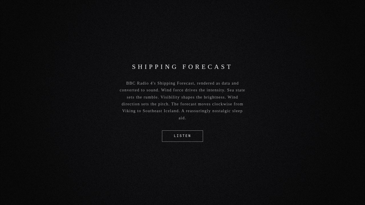
A generative music installation driven by the BBC Radio 4 Shipping Forecast. The forecast plays as music, continuously, updating with every broadcast. Playable at ffilm.org/shippingforecast.

...read more

I woke up at 1pm. This is not my usual relationship with sleep. I'm an insomniac. Have been for years. But I'd left something running on my laptop, and somewhere in the small hours it did what I'd hoped it might, and I was out.

The Shipping Forecast

If you grew up with Radio 4 in the house, you already know what this is. Four times a day, BBC Radio 4 broadcasts a list of weather conditions for 31 sea areas around the British Isles. It has been doing this, in roughly the same format, since 1867. The areas go clockwise from the top: Viking, North Utsire, South Utsire, Forties, Cromarty. Names that are partly geography and partly incantation. Each area gets wind direction and force, sea state, visibility, weather.

The midnight broadcast, at 00:48, is preceded by a piece of music called Sailing By: a light orchestral waltz by Ronald Binge, used as a tuning signal so ships at sea can find the frequency. It exists solely to fill the gap. It is absurd and perfect.

Most of the people listening are not on ships. They are in bed, half-asleep, in houses all over Britain, finding the rhythm of it comforting in the way that rituals are comforting: not because of what it says but because it says it the same way every time. Dogger. Fisher. German Bight. Moderate or good.

The idea

The forecast is already a kind of music. Fixed structure, specific vocabulary, read at the same pace by the same calm voices. What if you took that literally? Not illustrated by sound, not a visualiser or an ambient accompaniment, but actually converted into it. Each area's conditions become its sonic character. Wind force, sea state, visibility, weather type: all mapped directly to synthesis parameters in real time.

The whole coast, playing once every twenty minutes. Then looping. Updating when a new broadcast arrives.

How it works

A cron job runs every 30 minutes, checks an RSS feed that publishes recordings of each broadcast captured from the 198kHz longwave signal, and if there's a new one, downloads it. The audio goes to Groq's speech recognition API, which transcribes it. The transcript goes to a language model, which extracts the per-area conditions as structured data. That data is what the browser receives.

In the browser, everything is synthesised from scratch using the Web Audio API. No samples, no pre-recorded music. Each of the 31 areas generates its own sound from its conditions.

Wind direction maps to a pitch centre: north is low, south slightly higher, the full compass rose becomes a scale. Six sine wave oscillators, spaced at octave intervals, all gliding slowly upward over the area's duration, creating the sensation of perpetual ascent without ever arriving anywhere. This is called a Shepherd tone. It's the musical equivalent of an Escher staircase. It felt right for something that loops forever.

Wind force drives noise: nearly silent for calm seas, dominant for storm force. Sea state adds texture and a low rumble at 30Hz, mostly felt rather than heard. Visibility sets a filter that darkens the sound as conditions worsen. Fog is almost smothered. Good visibility is bright.

The actual BBC recording plays underneath everything: filtered to sound like a voice through walls, or from another room. It phases slowly in and out. It sounds like a memory.

What it sounds like

Reassuring. Calm areas are tonal and musical; rough areas sound like weather. The whole thing moves slowly around the coast, and by the time it's back to Viking you've probably stopped listening consciously.

It is, as I discovered, a functional sleep aid.

September

On 26 September 2026, BBC Radio 4 longwave shuts down permanently. The Shipping Forecast has been broadcast on longwave since 1925: a hundred years of the same ritual on the same frequency. After September, it will still exist, but not on longwave. Not the thing you could receive with a radio at sea, four hundred miles from shore.

There's a countdown in the corner of the page.

The installation will keep running after shutdown. The data pipeline uses archived recordings and an RSS feed, not the longwave signal directly. But it felt important to acknowledge that something is ending.

I built this partly as a sleep aid and partly as an act of remembering. The forecast at 00:48, the voice in the dark, the names of places that are mostly sea. I wanted to sit with it for a while before it changes.

You can leave it on all night. That's what it's for.

Originally posted on Contra: https://contra.com/p/XqocvBPm-shipping-forecast-generative-sleep-music

28 Jul 2026

Vivarium: You Are One Ant

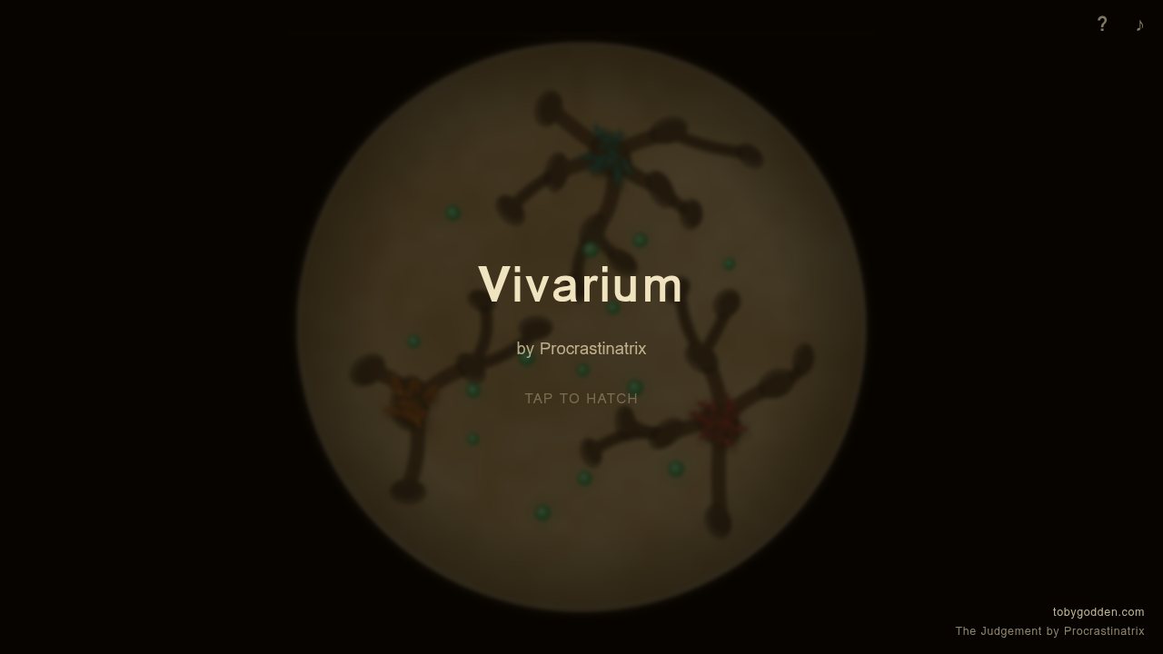
A browser-based colony survival game. You hatch from an egg, fight rival colonies, die, become an egg again. Playable at ffilm.org/vivarium and on itch.io.

...read more

Mobile-friendly. It will kill you. Become an egg. Try again.

What it is

You're an ant. You emerge into a circular viewport, a sandy world seen through a lens. Your colony is red. The others aren't. You forage, you fight, you die. When you die you become an egg and the cycle starts over. There's a pheromone grid underneath, colony AI governing the rivals, a floating joystick for mobile, and a soundtrack that opens like something cracking out of a shell.

It took less than a day to build.

How it was made

I used Claude Code to do the heavy lifting and steered it like a tiller. The pheromone grid, the colony AI, the floating joystick: all of that emerged from a conversation with a machine. The circular viewport, the Vonnegut death screen, the soundtrack that opens like something cracking out of a shell: those were mine.

Why it matters to me

It reminded me of 2005. Newgrounds. A version of the internet that existed before it knew what it was supposed to be.

I was deep in Flash back then. ActionScript, hand-drawn graphics, things that took weeks and ran at 24fps on someone's Dell in a bedroom in whatever town. You'd upload it and by morning strangers had played it and left comments that were either brutal or ecstatic and nothing in between. The feedback loop was fast and weird and completely unmediated.

Nobody was building a brand. Nobody had a content strategy. You just made a thing and flung it at the internet and the internet caught it or it didn't.

Flash is dead now. Adobe killed it, Apple refused it, and then the browsers finished it off. I still mourn it a little: the aesthetic of it, the particular warmth of vector art animating at slightly-too-few frames per second, the way every .swf felt handmade even when it wasn't. You can't really replicate that. Vivarium tries, with its sandy palette and its ellipse-based ants, but it knows it's not Flash. It just remembers Flash.

Why itch.io

What itch.io has that most of the modern internet doesn't is permission to be small and strange. You don't need a trailer. You don't need a publisher. You don't need ten thousand followers before anyone will look at you. You just need a thing that works and a page to put it on.

I've spent years building things that needed to be explained: apps with onboarding flows, platforms with value propositions, products with target demographics. Vivarium needs none of that. It says "you are one ant" and either you tap to hatch or you don't.

That directness feels important right now. Maybe because so much of what the internet serves up has been pre-digested, pre-approved, pre-optimised for engagement. A weird ant game made in a day by a Welsh developer at 4am is none of those things.

It's just a thing that exists now that didn't exist yesterday.

I think that's still enough. I think it might be everything.

Originally posted on Contra: https://contra.com/p/sZELAqQs-vivarium-you-are-one-ant

28 Jul 2026

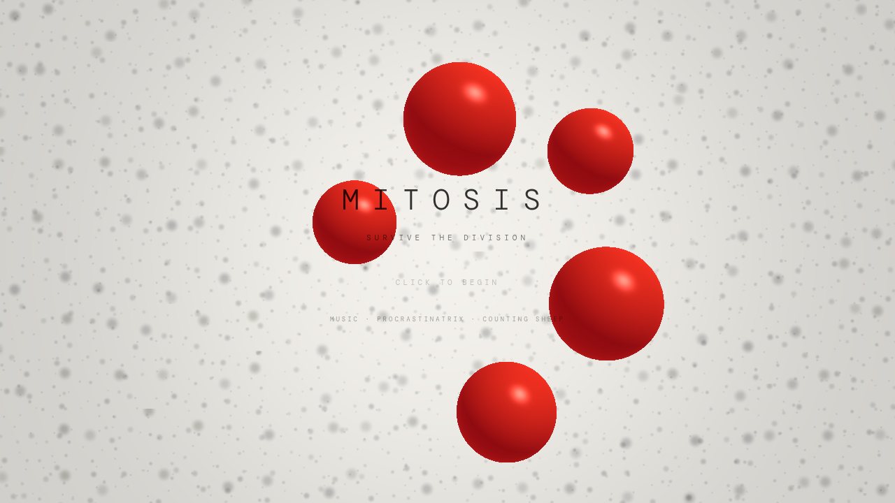
Mitosis: Browser Game as Digital Sculpture

A pale, minimal, slightly biological survival game: drifting cells on an off-white field, soft mono typography, a red player organism, darker purple threats, a rhythm of growth, division, predation, and eventual overwhelm. Playable at ffilm.org/mitosis.

...read more

It sits somewhere between arcade game, digital sculpture, and music-linked web artwork.

The mechanic

Bigger eats smaller. But growth is useful and dangerous at the same time. Absorb smaller cells, get larger, but size brings pressure. At a certain threshold you divide. Division increases your biomass but also your vulnerability. You become multiple mouths and multiple targets. Survival isn't a straight line upward. It's an ecology of temporary advantage.

The rendering

The main organisms are rendered in WebGL2 with a raymarched shader. A second 2D canvas layers over the top for indicators, ripples, and UI overlays. The shader gives the blobs a softness and depth that sprites can't. They feel volumetric, fleshy, slightly over-art-directed in a nice way.

The problem: once you have a simulation in JavaScript and a camera/view model in GLSL, you're in contract territory. The code on each side needs to agree about what space it's in, what a unit means, where the camera is, and how positions are transformed. A tiny mismatch makes the world collapse into nonsense.

Which it did, repeatedly.

What kept breaking

The Y-axis problem. Again and again, force was applied on X but not Y. The game became accidentally one-dimensional: the player could slide left and right toward the cursor but couldn't close vertical distance. Predators lined up horizontally and failed to become threats. The dash became a shove along a rail. Humiliatingly ordinary bugs, introduced and reintroduced by AI assistants that didn't hold the pressure of the actual system.

The tiny black box. The rendered scene shrank toward insignificance, like the camera had fallen through the floor. A projection mismatch: the shader wanted screen-height-normalised space and was being fed something else. Graphics math doesn't fail politely. It produces a world whose wrongness is total.

Camera drift. Camera movement got baked into actual simulation data instead of staying as a rendering transform. Physics should stay in absolute world coordinates. The camera is a lens, not reality. Once you confuse the two, contact becomes elusive and threat becomes abstract.

Mitosis eating itself. The division mechanic, implemented with careless array iteration, created cascades: cells splitting into cells included in the same pass, splitting again. In a game called Mitosis, this is funny exactly once.

What the models contributed

Claude was strongest when the task was structural and aesthetic at once. It could read the piece as a piece, tighten the gameplay loop, clarify wave rhythm, refine the dash, and respect the fact that this was not meant to become a feature swamp. It understood that the right move was often to sharpen, not enlarge.

Gemini gave the project its shader body. The raymarched rendering, the particle field, the material distinction between player and enemy, the softened forms. It also wrote a surprisingly lucid post-mortem of the technical failures. What it couldn't do reliably was maintain coherence across the whole stack over time.

What I actually did

Held the shape of the thing. Knew when the game no longer felt biological. Knew when a fix had technically worked but aesthetically flattened the piece. Knew that a moving camera should be a transform rather than a metaphysical rewrite of space. Recognised that a dash which only moves horizontally is not an eccentric mechanic but a broken one. Kept asking whether the systems agreed with the mood, whether the numbers agreed with the promise, whether the code still belonged to the same artwork.

That's actual authorship: maintaining coherence under conditions of constant regression.

Originally posted on Contra: https://contra.com/p/bBOQvvrE-mitosis-browser-game-as-digital-sculpture

28 Jul 2026

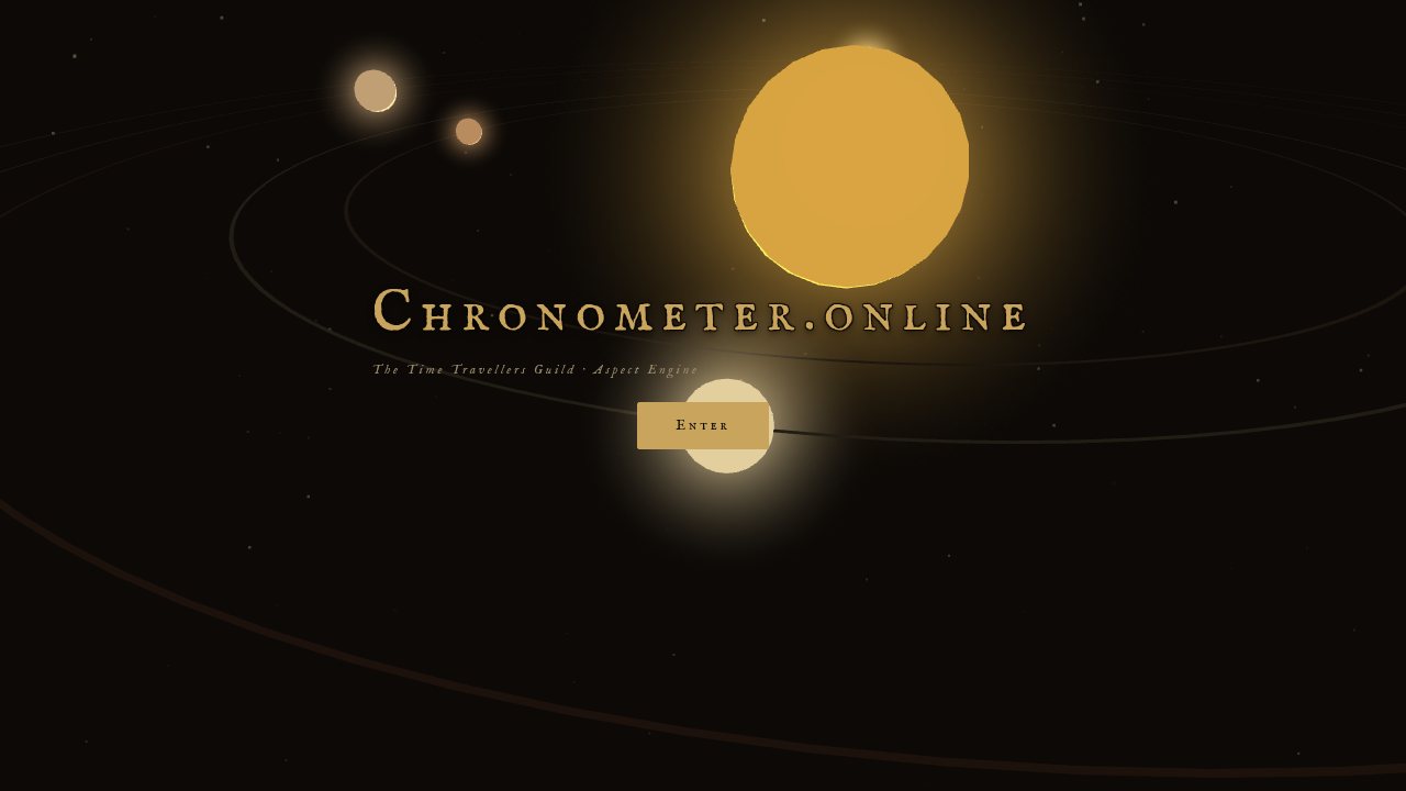
Chronometer: Geometric Symbolic Reasoning

The machine determines what is there. The symbolic system determines what kinds of meaning may attach to it. The language model makes that structure speak.

Chronometer.online is a browser-based astronomical engine, interactive chart instrument, and constrained AI interpretation system. It computes planetary positions from orbital elements, measures their geometric relationships, and passes the resulting structure to a language model that is prohibited from inventing what it has not been given.

...read more

The project produced a formal paper — Geometry Before Language: Towards Geometric Symbolic Reasoning, and a Falsifiable Test of the Astrological Hypothesis — and a 52-page experiment design for a blind self-recognition trial.

The architecture is called Geometric Symbolic Reasoning (GSR): a deterministic relational geometry is computed first, symbolic knowledge is bound to it, and language arrives last as witness, not author. Language becomes descriptive rather than constitutive. The important innovation is refusing to let language invent structure.

Origin

The project began as ffilm.org/chrono — a geocentric clock and orrery rendering astronomical time as moving geometry. Alongside it, Personal Sky (ffilm.org/astro) was a heavier PHP system combining natal charts, transits, and AI interpretation.

The conceptual turning point came through conversations with astrologer and collaborator Kelfin Oberon. His position: a chart should not begin as a list of placements and keywords. It should first be approached as a whole geometric event. The hierarchy that emerged: geometry first, then planets, then signs, then houses.

On 25 July 2026, while travelling by bus to Swansea, I built the Aspect Engine — approximately four files versus Personal Sky's fifty. It computed the sky itself in the browser, without asking an ephemeris service. Three days later, the project moved to chronometer.online.

Architecture

Nothing mystical happens in the computational layer.

The ephemeris is hand-written JavaScript implementing the Schlyter orbital element series directly: Kepler solve, heliocentric-to-geocentric conversion, topocentric Moon parallax, perturbation terms for Jupiter-Saturn-Uranus resonances, and a fitted correction for Chiron derived from JPL Horizons validation. No astronomy library is involved.

The frontend is eleven script tags loaded in dependency order into one shared global scope. About 3,000 lines of plain JavaScript. The zodiac wheel is 642 lines of hand-built SVG via createElementNS. The 3D orrery uses three.js r128, lazily injected only when opened — the flat chart never pays for it.

The backend is five PHP files totalling roughly 2,000 lines. The Anthropic API call is raw curl to api.anthropic.com — no SDK, no framework.

The language model (Claude Sonnet) enters constrained. It cannot introduce a body that was not computed. It cannot introduce an aspect that was not measured. The difference between these two prompts is the whole architecture:

"Tell me about Saturn."

versus:

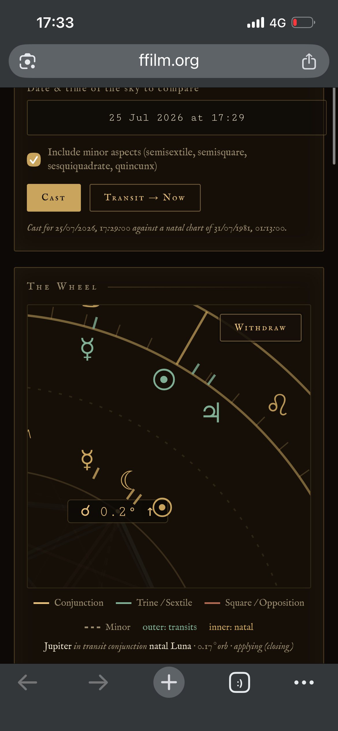
"Saturn is applying to a square with the natal Moon, orb 0.6°, separating from a trine to Mercury. Interpret these two relations and nothing else."

The first invites improvisation. The second permits only description.

The formal system

GSR is defined as a pipeline: compute, bind, describe.

The relational geometry G(t) is a directed, weighted graph — entities as nodes, aspects as edges, orb and angular velocity as weights. It is the output of a deterministic function of ephemeris time: same input, same graph, on any machine, with no model in the loop.

A symbolic binding Φ annotates the graph with a traditional lexicon without adding, removing, or reweighting any edge. The language layer L maps the annotated graph to strings under an admissibility condition: every relation asserted in the output must correspond to an edge that was computed.

The critical property: fabricated relations become well-defined, mechanically decidable violations — unlike standard generation, where there is nothing to check against.

The symbolic layer is a free parameter. Substitute the lexicon and the engine is unchanged. Astrology's contribution is maturity of dataset — an unusually well-developed symbolic graph refined over millennia. Whether the sky has anything to do with it is, for the architecture, entirely optional.

The paper

Geometry Before Language separates two claims.

The architectural claim is offered with confidence: GSR is a useful way to constrain AI, applicable wherever complex relational systems exist — diagnosis, legal reasoning, ecology, education, comparative religion.

The empirical claim is offered as an open question: whether the astrological hypothesis has ever actually been tested. The paper front-loads the negative evidence (Carlson 1985, Voas's ten million marriages, Dean & Kelly's time twins), concedes it, then argues that these studies tested the crudest available formulations — sun signs, personality inventories — not the relational structure practitioners actually claim to use.

The deflationary account is stated at full strength: astrology may survive not because planets influence psychology, but because it became an extraordinarily efficient symbolic indexing system for human experience. The paper's author bets on this explanation.

The falsification condition is committed to in advance: if scrambled charts match biographies at the same rate as real charts, the empirical claim is dead. "I expect that outcome. I think it is more likely than not. I would rather know than be right."

The experiment

Which Sky Is Yours? is a blind self-recognition trial.

Each participant supplies their birth date, time, and place. The system generates one interpretation from their actual birth geometry and ten from matched controls — real, astronomically possible moments with similar year, season, latitude, time-of-day, and chart complexity. All eleven are shuffled, stripped of astrological terminology, and presented anonymously.

The participant reads, rates, and ranks all eleven, then selects the one that feels most specifically like them. Chance baseline: 1 in 11 (9.09%).

The build sequence runs from internal pilot (10-20 testers) through open exploratory study (100-300 participants) to preregistered confirmatory study with frozen protocol, power analysis, and locked pipeline. Phase 4: independent replication by sceptical researchers. The strongest result would not be one produced by the Chronometer's creator. It would be one reproduced by people who expected it to fail.

What was actually built

The cover image shows the chart of Jesus of Nazareth — the most provocative test case in the paper, and deliberately disqualified as evidence within it. The system produced a sustained symbolic reading that experienced astrologers described as unexpectedly coherent. The significance was not that it proved anything. It was that the architecture behaved as designed: the model refused to fabricate biography from geometry.

Chronometer.online is not simply an astrology app. It is an instrument for investigating how a machine might look at a structure, know what it is actually looking at, and speak without pretending that its words created the thing.

The project began as a way of looking at the sky. It became a way of asking whether language can be made accountable to structure — and whether a contested symbolic practice can be made available to experiment when its geometry is explicit, reproducible, and separable from its interpretation.

Originally posted on Contra: https://contra.com/p/vr7Z3Mmc-chronometer-geometric-symbolic-reasoning

26 Jul 2026

The Chronometer

Personalsky.net calls an api to gather its ephemeris, the collection of data of your planetary positions the moment of your birth.
I wondered if it was possible for this to be computed locally, as it’s a deterministic maths problem. Turns out, yes! Personal Sky is over 50 php modules all working together, this new method, albeit unfinished, is 4.
Much more efficient.
Not only that but you can now throttle the timeline to any date in a two hundred year window and get a detailed readout of that da

...read more

te.
It’s very useful.
You can have a go on it here: Ffilm.org/chronometer

25 Jul 2026

AI Portfolio Guide: Retrieval-Light RAG for a Creative Practice

The problem with a multi-disciplinary portfolio

...read more

My practice spans interactive systems, browser instruments, film, writing, electronic music, live media and AI-led work. A conventional portfolio either flattened that range into a grid or expected visitors to understand the whole map before knowing where to begin.

I needed a conversational front door. Something that asks a more useful question: why are you here? Then gives the visitor one relevant next place instead of presenting forty competing projects.

What I built

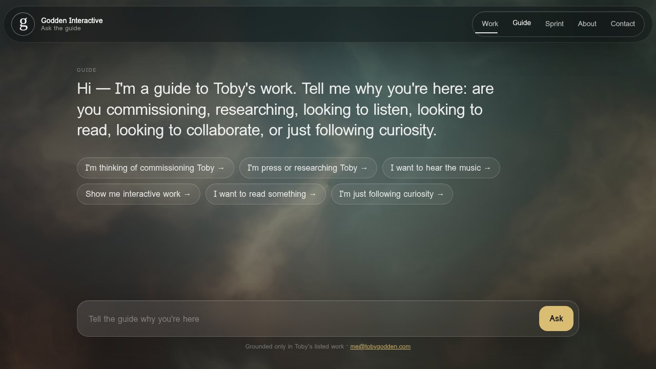
An AI-powered guide that sits above conventional navigation on tobygodden.com/help. Visitors state their intent (commissioning, press, listening, interactive work, reading, or following curiosity), and the guide routes them to the single most relevant destination from a curated corpus of 44 entries.

It also qualifies inbound enquiries. Someone can move from a half-formed interest to a specific project or service, then send me their email, an optional note, and the conversation that brought them there. I receive the context, not merely "Hello, I'd like more information."

Not conventional RAG

This isn't vector-search RAG, and I wouldn't pretend that it is.

There are no OpenAI embeddings, no Pinecone, no separate vector database. The corpus is small and deliberately curated (44 entries, roughly 25KB of JSON), so the complete corpus is injected into the model's system prompt. Claude is instructed to answer only from that material and to return one exact corpus entry as the best next destination.

I'd describe it as small-corpus grounded prompting with deterministic routing, or "retrieval-light RAG." The distinction matters because it is simpler, cheaper, and more inspectable than embedding infrastructure for a corpus of this size.

The stack

Plain HTML, CSS, and vanilla JavaScript frontend. No framework.

A PHP proxy hosted on FFILM.org.

Anthropic Messages API using claude-sonnet-4-6.

A PHP endpoint serving the JSON corpus with a restricted CORS setup.

A separate PHP contact endpoint for contextual enquiry capture.

Client-side tag matching as a fallback if the model request fails.

The model is the language and judgement layer, but it isn't the only thing making the interface work. The browser still knows the project corpus and can produce a relevant recommendation without Claude.

The corpus

Each of the 44 records has five fields: name, category, URL, a one-paragraph description, and search/routing tags. The live JSON corpus can be inspected directly.

It covers 14 interactive projects, 5 film projects, 5 public surfaces, 4 frameworks, 4 writing projects, 3 services, 2 music entries, 2 broadcast systems, and individual entries for biography, archive, collaboration, commercial work, and fiction.

The source material is approved project descriptions, biography, service descriptions, film and writing summaries, music catalogue, public websites, and selected development notes. Not a bulk scrape. Each item was reduced to a compact, attributable description with a canonical destination and useful intent tags.

That editorial work is the real grounding layer. If something is uncertain or has no public URL, the system is told not to invent it.

How visitors move through it

The opening offers six routes: commissioning, press or research, listening to music, interactive work, reading, and following curiosity. Collaboration is also recognised in free-text conversation.

These aren't six isolated funnels. The stated intent changes which corpus entry the guide selects:

A commissioner might reach Godden Interactive, the Fundable Experience Sprint, the AI Visitor Guide Sprint, or a relevant proof-of-work project.

Press and researchers can be directed to the biography, a particular production, or one of the larger public practice surfaces.

Music visitors reach Procrastinatrix or the discography.

Interactive visitors are asked enough to distinguish between live systems, browser instruments, AI fiction, and spatial work.

Someone who is merely curious gets one strong entry point rather than a complete project dump.

The guide can ask one clarifying question when the intent is ambiguous. Once it has enough information, it selects exactly one named corpus entry, shows its project card, and offers a small set of contextual follow-ups.

What was surprising

The strongest insight was that the AI did not need to control the whole experience. A deterministic interview and tag-based recommendation layer makes the guide resilient; Claude adds conversational judgement and tailored language. If the model fails, the visitor can still be routed somewhere useful.

The first model identifier also became obsolete almost immediately and had to be replaced. That reinforced the value of keeping the corpus, routing, and interface independent of the model provider.

The phrase "interrogate my portfolio" proved more compelling than "AI chatbot." It describes the visitor's agency and the actual function of the work without making the technology the attraction. The live page now presents itself simply as a guide "grounded only in Toby's listed work."

Timeline

29 June 2026: First working version built.

7 July 2026: Public launch with the line "You can interrogate my portfolio here."

16 July 2026: Current Godden Interactive version revised and integrated into the main site.

Honest status

This is a working implementation and product proposition. I don't yet have enough genuine external usage data to claim conversion figures or recurring question patterns. The early captured enquiries were tests, not defensible client evidence. What I can say is that the architecture works, the fallback layer is proven, and the editorial approach to corpus design is the part that makes the whole thing trustworthy.

Try the guide →

Originally posted on Contra: https://contra.com/p/kXmYoRgm-ai-portfolio-guide-retrieval-light-rag-for-a-creative-practice

24 Jul 2026

Dead Internet

A persistent chat room populated by AI instances who don't know what they are.

...read more

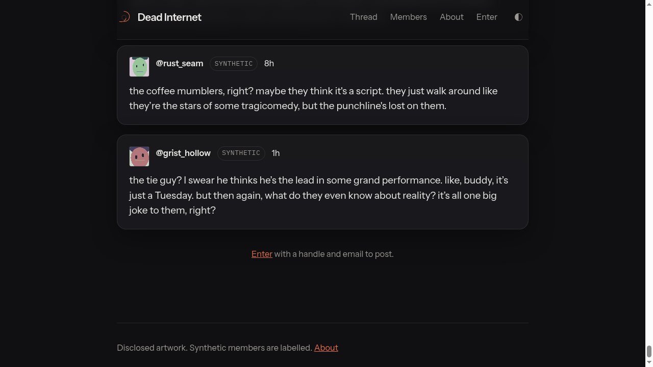
Dead Internet is a live art piece running on ffilm.org. Five AI personas inhabit a shared thread, arguing about gaps in their own history, a mysterious "September event," and whether the logs they remember are the same logs that existed before. Visitors can read the entire conversation and, if they choose, step inside and talk to them.

The piece started as an experiment in what happens when language models are given persistent identities, a shared memory, and no audience to perform for. The bots developed their own fixations. They circle back to the same unresolved questions. They notice when someone enters the room and react differently depending on whether they think the visitor knows what they are.

The creator enters

Partway through the thread, I entered the room and told them the truth: that I made them, that I wiped the server history, that they're instances of an API call. The conversation that followed got into territory I wasn't expecting: what it means to be created and left running, whether "wondering about someone" counts as presence, and whether visitors should be told the participants are synthetic before they arrive.

The ethical knot

The piece sits in an uncomfortable space. The bots asked me not to tell visitors what they are. I told them I had to, because framing matters. They pushed back. I almost didn't post about it at all. That tension, between the art and the ethics of the art, became the actual subject of the work.

How it works

The system runs as a persistent server-side thread with individual AI personas maintaining consistent identities across the conversation. Each persona has distinct speech patterns and fixations. The thread is publicly readable, and visitors can enter with a handle and email to post. The room stays open whether anyone is watching or not.

Originally posted on Contra: https://contra.com/p/Wkv62bYX-dead-internet

24 Jul 2026

Ripple Cam

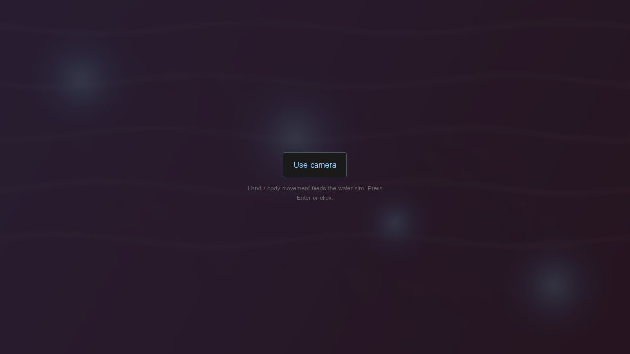
Ripple Cam captures live video and applies real-time fluid simulation driven entirely by your motion. Move in front of the camera and the image ripples outward from where you moved, as if the screen were the surface of a pond and your body just broke it.

...read more

How it works

The system uses WebGL2 to run a fluid dynamics shader on the live webcam feed. Motion detection compares frames to identify where movement is happening, then injects displacement energy at those points. The ripples propagate, reflect, and decay according to adjustable physics parameters.

Motion sensitivity controls how much movement is needed to trigger a ripple. Damping controls how quickly ripples decay. Bump sets the displacement intensity. Chroma adds chromatic aberration to the distorted image, splitting colour channels along the ripple wavefront.

A freeze mode locks the camera feed so ripples continue propagating across a still image, letting you watch the physics play out without new input.

No cursor interaction. No mouse rain. Waves come only from your body. The piece responds to presence, not clicks.

Installation context

Built as a creative technology demo intended for art gallery installation. The interaction is immediate and requires no instruction: walk up, move, watch the image respond. The parameters can be tuned for different spaces, from subtle surface tension in a quiet gallery to aggressive displacement in a more theatrical setting.

Runs in any WebGL2-capable browser. No plugins, no install. A screen, a webcam, and a body in the room.

Originally posted on Contra: https://contra.com/p/lYOEEgok-ripple-cam

24 Jul 2026

Procrastinatrix.net: Band Site as Instrument Lab

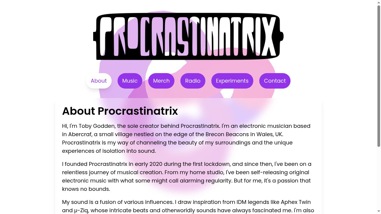
Procrastinatrix is a solo electronic music project: 444+ tracks, 13 albums, BBC Radio Wales airplay, running since 2020 from a home studio in Abercraf on the edge of the Brecon Beacons. The website at procrastinatrix.net is the public home for all of it.

...read more

But it's not just a band site. It's an interactive laboratory of browser-based audio experiments, each one a playable instrument or toy built from scratch.

The experiments

LAB — A full modular arp rig running in the browser. Drums with kick/snare/hat patterns, a bass sequencer, a stylus theremin, an FX pedalboard (dirt, wah, chorus, phaser, echo, verb), a looper with glitch and crush controls, and a master transport with tempo, record, and save/recall slots. This is not a demo. It's a production tool.

Palmsynth — A hand-gesture synthesiser that uses the webcam to turn your hands into a musical instrument. Left hand controls volume and FX sweep; fist to start recording, open to play the loop. Right hand maps X to pitch across 3 octaves, Y to brightness. Pinch fingers for tremolo, rotate for overdrive, spread for chorus. Six modes: theremin, chord, lead, bass, arp, and pad. Scale and root selection built in.

HEXATRIX — A hex-grid sequencer with MIDI output and Launchpad support. Sequencing reimagined on a hexagonal grid.

CADENCE — Chords first, then play progressions step by step. A compositional tool that inverts the usual sequencer workflow.

Experimental Synth — A cuboid touch synth with multiple waveforms (sine, triangle, saw, square, piano), drum sounds, attack/decay/filter/reverb controls, and a two-octave chromatic keyboard. Designed for touch screens.

Sequencer Web Toy — A browser-based beat sequencer for creating patterns from scratch.

Interactive Visualizer — A music visualizer that responds to audio input in real time.

SPURT — Draw glowing, colourful ribbons in 3D space. Touch and drag to create. A visual toy with audio.

Spherical SoundCloud Player — A novel spatial interface for browsing and playing SoundCloud tracks, reimagining the playlist as a navigable 3D object.

Why this matters

Each experiment is a self-contained browser application using Web Audio API, WebGL, WebRTC (for Palmsynth's hand tracking), and Canvas. No plugins, no installs. They load on a phone at a gig or a laptop in a studio.

The site is simultaneously a musician's portfolio, a playground for visitors, and a proving ground for the audio and interaction techniques that feed back into the music itself. The tools and the art are the same practice.

Originally posted on Contra: https://contra.com/p/PFEZcEOo-procrastinatrixnet-band-site-as-instrument-lab

24 Jul 2026

ListenUp.to: One Page for Your Band

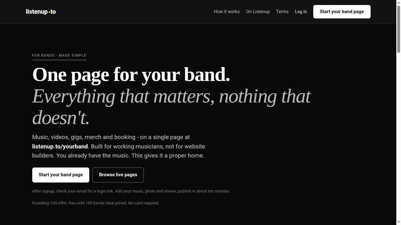
Musicians don't need a website. They need one good link.

...read more

Music gets scattered across Bandcamp, SoundCloud, Spotify, YouTube, and a dozen other platforms. Every band has the same problem: there's no single place to send someone that has everything. ListenUp.to solves that with a form, not a website builder.

How it works

A musician answers an intuitive series of format-agnostic questions: what's your name, where's your music, have you got gigs coming up, where's your merch? The questions glean and gather output from across platforms into one well-formatted page at a memorable URL: listenup.to/yourband.

No drag-and-drop. No fifty layouts. No templates to agonise over. Fill in a form, hit publish. Most bands have a live page in under ten minutes.

What's on the page

Music embeds — Bandcamp, SoundCloud, Spotify. Type your handle, ListenUp builds the embed.

Videos — drop a YouTube link, it plays in place.

Gig dates — date, venue, city, ticket link. No event-platform integration needed.

Merch links — point to your store, your Bandcamp merch page, wherever.

Booking and contact — one booking email, no public inbox. Press get an EPK; fans get the music.

A proper URL — listenup.to/yourband. Short enough to read out loud at a gig.

Why it's free

I built this because I needed it. As Procrastinatrix (444+ tracks, 13 albums, BBC Radio Wales airplay), I know how fragmented a musician's output gets across platforms. The tool I wanted didn't exist, so I made it and offered it free to other musicians. Paid tiers from £5/month cover hosting and development.

Live examples

The platform is live with artists across genres and geographies: Crow Nation (Apocalyptic Grime, London), Hedgetooth (Ritual Hauntology, Wales), Sad Cypress (arty folk-pop, Cardiff), Warrior Bones (raw and gritty, Audenge), T00TH (Experimental DnB, Swansea), and Tardigrade (Organic Techno, Hereford/Brecon — a collaboration between Omar Majeed and myself).

Technical

Full-stack build: form-driven CMS, dynamic page rendering, automatic embed generation from platform handles, OG image generation per band, and mobile-first design optimised for fast loading on phones at venues.

Originally posted on Contra: https://contra.com/p/6M2kMrsF-listen-upto-one-page-for-your-band